Section 2 - Basics
Section 4 - Advanced
Fancy Lists
Forms
Advanced Tables
Frames
Style Sheets
Image Maps
Why Image Maps?
Suitable Images
Select Hot Spots
The Code
Examples
You try it
Section 5 - Publishing
Section 6 - Extras
Appendices
Choosing the Image
 The first thing you want to do when creating an image map is to select a suitable image. This page gives you the keys to selecting an appropriate image.
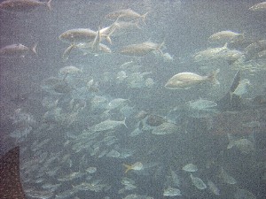
Take a look at the image at the right. It's an image map. Do you know what to click on? It's tricky. This is an example of a bad picture to use. Rule #1 is to select a picture where the clickable areas, or "hot spots" are clear and easy to find.
Sometimes a photograph can be a good image map, but sometimes it can't. If you use a photo, select one where the clickable areas are well defined and easy for the user to locate.
 At the left is another example of an image map. This one is much easier to find the "hot-spots" but may not be as attractive. A balance between the two is important.
so, Rule #2 is to make sure that your image map is attractive. It should work well with your page and add to the site, never distract the user. If your image map doesn't look good, don't use it on your site.

The footprints up above are also an image map. Partially, this was to show your that you can have an animated image as an image map. One of the problems with the footprints is that you'd never know it's an image map without being told. Another problem is that the image moves, but the "hot-spot" doesn't. The hot spot is the first foorptint.
Perhaps we can throw in a rule or two here. Let's make Rule #3 to make sure your client (viewer) knows your image map is clickable. If they don't know you can click, it's pointless.
Perhaps we could add one more note, Rule #4 - If you use an animated gif, make sure your hot-spots don't move off of the image (or more accurately, your image doesn't move out from under the spots.)
To sum this up,
- Choose an image with clear hot-spots
- Choose an attractive image
- Make it an obvious image map
- Be careful with animated images.

|

|

|