Section 2 - Basics
Section 4 - Advanced
Fancy Lists
Forms
Advanced Tables
Frames
About frames
Frameset
Frame source & name
Target & Noframes
Frameset borders, etc.
Scrolling & Resizing
Should you? Try it
Style Sheets
Image Maps
Section 5 - Publishing
Section 6 - Extras
Appendices

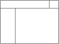
Well, so far you've only learned to make frames with either rows or columns, but not both. How is this problem solved?
By putting framesets within framesets.
That's right, frames within frames is how to get a page divided up exactly the way you want it. Let's look at the picture above. If I wanted to make a page that looked like this, I would first try to divide it into two sections. You may notice a horizontal line spanning the page. Just measuring it with the eye, it looks like it takes up about 15% of the page. So, the first thing I would do is to make a frameset like this:
- <html>
<head></head>
<frameset rows="15%,*">
</frameset>
</html>
- <html>
<head></head>
<frameset rows="15%,*">
<frameset cols="80%,*">
</frameset>
</frameset>
</html>
- <html>
<head></head>
<frameset rows="15%,*">
<frameset cols="80%,*">
<frame src="cool.html" name="topbar">
<frame src="fuzzy.html" name="stamp">
</frameset>
</frameset>
</html>
-
<frameset cols="20%,*">
<frame src="framesblank.html" name="left">
<frame src="wuzzy.html" name="main">
</frameset>
- <html>
<head></head>
<frameset rows="15%,*">
<frameset cols="80%,*">
<frame src="cool.html" name="topbar">
<frame src="fuzzy.html" name="stamp">
</frameset>
<frameset cols="20%,*">
<frame src="framesblank.html" name="left">
<frame src="wuzzy.html" name="main">
</frameset>
</frameset>
</html>

|

|

|